Antiquity
page layout & branding
PROJECT NAME/
Menu Design
DURATION/
4 Weeks
OBJECTIVE/
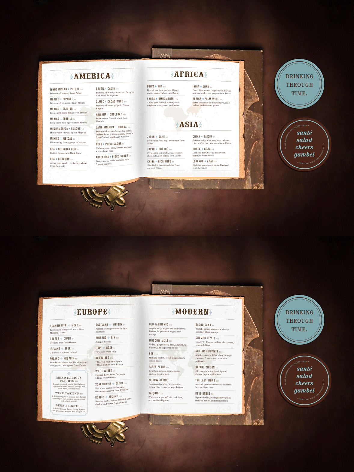
Antiquity is located in Julian, Ca. a small country town with full of passion and culture. Antiquity is a bar where you can find any desire drink that was invented million years ago from around the globe. Empires and countries had bless us with great infusions. The specializes on different spices, fermentations, and fruits. the interior of the bar is rustic with pine wood, leather, and soft light to make the atmosphere more intimate. Antiquity is stylish but semi casual it targets adults from the ages 25 + that are willing to adventure the gods’ holy waters.
SOLUTION/
To mmunicate the rustic and woody feel the antiquity logo and brand is composed with more than one typeface, Blackriver bold, Bahemoth, and Abril Fatface. These were chosen to make the logo cohesive and the idea is to have multiple cultures can work together. The brand uses muted earth tones to symbolize spices, fruits, nuts from the earth. The cinnamon brown is the primary color for the brand and the sky blue is used to make a statement. the menu is organized by continents and from there the client can see where the libations are originally from.
logo

color palette
coaster design


